HMI Design Best Practices: ISA-101 Screens & Checklist
Apply ISA-101 HMI design principles with a practical display hierarchy, restrained color, alarm guidance, screen examples, and an engineering review checklist.
HMI design best practices are human-factors-grounded principles for building operator interfaces that support situational awareness, reduce avoidable interaction errors, and fit the process-control task. ANSI/ISA-101.01-2015 provides a lifecycle framework for HMIs in process automation, while the ISA-101 technical reports expand on HMI philosophy, usability, performance, auditing, validation, and management of change.
Effective HMI design is an operational discipline, not a styling exercise. Display hierarchy, consistent state indication, alarm presentation, navigation and trend context all affect what an operator can notice and verify during normal and abnormal conditions.
The magnitude of any safety, response-time or training benefit is site-specific and must be measured. This guide therefore avoids universal incident percentages and return-on-investment claims. Use task-based usability tests, alarm-system metrics, incident reviews and operator feedback to establish a before-and-after result for your own system.
This definitive guide to HMI design best practices covers every critical aspect of creating effective SCADA and industrial operator interfaces, from fundamental design principles and color theory to advanced alarm management, responsive design strategies, and compliance with ISA-101 standards. Whether you're designing new HMI systems, upgrading legacy interfaces, or establishing corporate design standards, this comprehensive resource provides actionable guidance for creating operator interfaces that enhance safety, efficiency, and usability.
Modern industrial environments demand HMI designs that support both experienced operators and new personnel, function reliably across different screen sizes and resolutions, integrate seamlessly with mobile devices, and provide the situational awareness necessary for effective process control in increasingly complex automation systems.
Table of Contents
- Why HMI Design Best Practices Matter
- Fundamental HMI Design Principles
- ISA-101 Standards for HMI Design
- Color Usage and Psychology in HMI Design
- Typography and Readability Best Practices
- Layout, Spacing, and Visual Hierarchy
- Alarm Management and Visualization
- Navigation and User Experience Design
- Data Visualization Best Practices
- Responsive Design for Different Screen Sizes
- Accessibility Considerations for HMI Design
- Performance Optimization for HMI Systems
- Security Considerations in HMI Design
- Common HMI Design Mistakes to Avoid
- HMI Design Process and Workflow
- Testing and Validation of HMI Designs
- Mobile HMI Design Considerations
- Scenario-Based HMI Design Review
- HMI Design Checklist
- Frequently Asked Questions
Why HMI Design Best Practices Matter
Human machine interface design quality directly impacts plant safety, operational efficiency, and profitability across all industrial sectors. Understanding the measurable benefits of proper HMI design provides essential justification for implementing comprehensive design standards and investing in interface improvements.
Impact on Operator Performance and Safety
Well-designed HMI systems can reduce cognitive load by presenting information in logical hierarchies that match the process and the operator's tasks. Validate this locally with timed abnormal-situation scenarios rather than assuming a generic response-time improvement.
Situational awareness improvements from effective HMI design enable operators to identify developing problems earlier, providing more time for corrective action before situations escalate into safety incidents or production losses. Clear visual indication of equipment status, alarm priorities, and process trends helps operators maintain comprehensive understanding of plant conditions even during complex multi-variable upsets.
Reduction in operator errors represents one of the most significant safety benefits of proper HMI design. Confusing navigation, inconsistent color usage, cluttered screens, and poor alarm management all contribute to operator mistakes that can have catastrophic consequences in process industries handling hazardous materials or operating at extreme temperatures and pressures.
Fatigue reduction through well-designed interfaces improves operator performance throughout extended shifts. Excessive visual clutter, poor contrast, inconsistent layouts, and information overload all contribute to operator fatigue that degrades decision-making ability and increases error probability, particularly during night shifts or extended upset conditions.
Operational Efficiency and Productivity Benefits
Production throughput improvements result from HMI designs that enable operators to optimize process parameters more effectively by providing clear visualization of process constraints, equipment performance, and quality variables. Operators using well-designed interfaces can maintain processes closer to optimal setpoints, resulting in measurable improvements in product quality, energy efficiency, and yield.
Downtime reduction occurs when HMI systems provide operators with sufficient diagnostic information to identify and resolve problems quickly. Effective HMI design includes clear indication of equipment status, historical trends showing pre-upset conditions, and logical organization of diagnostic information that accelerates troubleshooting during unplanned outages.
Consistent navigation and display patterns can make training easier, but training time depends on process complexity, procedures, staffing and prior experience. Record task completion, navigation errors and instructor interventions during a representative training scenario.
Maintenance efficiency improves when HMI systems provide maintenance personnel with clear access to equipment status, diagnostic information, maintenance schedules, and historical performance data. Integration of maintenance management functions into HMI systems reduces time spent searching for information and improves preventive maintenance compliance.
Return on Investment from HMI Design
Do not assume a generic payback period for an HMI redesign. Build the business case from the site's baseline: operator task time and error rate, alarm floods and bad actors, downtime events where interface evidence mattered, training effort, change cost, and the cost of validation and migration. Track the same measures after rollout and separate HMI effects from simultaneous process, staffing, and control changes.
Competitive advantages result from facilities that operate more efficiently, produce higher quality products, and respond more quickly to changing market conditions. Superior HMI design enables operational excellence that translates directly into improved market position and profitability.
An HMI can support audit trails, access control, records, and operating procedures, but it does not establish regulatory compliance by itself. Identify the applicable jurisdiction, sector, records, system boundary, and retention rules during requirements work, then verify the implemented controls and evidence.
Fundamental HMI Design Principles
Core HMI design principles establish the foundation for creating effective operator interfaces regardless of specific industry, platform, or application. These principles derive from human factors engineering research and decades of industrial automation experience across diverse process and manufacturing environments.
Hierarchy and Information Architecture
Visual hierarchy guides operator attention to the most important information while maintaining awareness of overall system status. Proper hierarchy implementation uses size, color, contrast, position, and animation to create clear distinction between critical alarms, important process variables, and background information that operators need for context but not immediate action.
Information architecture organizes HMI content in logical structures that match operator mental models of process equipment and control strategies. Effective organization follows process flow, equipment grouping, or functional areas rather than arbitrary arrangements based on PLC organization or historical precedent.
Level-of-detail management provides overview displays showing complete facility status, area displays focusing on specific process sections, and detail displays presenting comprehensive information about individual equipment or control loops. This multi-level approach prevents information overload while ensuring operators can drill down to required detail when needed.
Process flow representation should mirror actual physical layout and material flow through the facility. Operators develop spatial understanding of equipment location and process connectivity through HMI graphics that reflect plant geography and piping arrangements rather than abstract schematic representations.
Consistency Across All Screens
Define color meanings in the site's HMI philosophy and apply them consistently. Do not assume that green must mean running, red must represent every fault, or gray must always mean disabled: those choices can conflict with an established facility convention or make normal operation too visually prominent. Pair every color-coded state with text, shape, icon, pattern, or position and validate it with representative users.
Navigation consistency places controls, menus, and navigation elements in identical locations on every screen. Operators should never search for navigation controls or wonder how to return to overview displays. Standard navigation bars, consistent button placement, and predictable screen transitions reduce cognitive load and improve efficiency.
Symbol standardization uses identical graphic representations for pumps, valves, motors, and other common equipment throughout all HMI screens. Custom symbols for each screen or inconsistent representations of similar equipment create confusion and increase training requirements. Learn more about standardized industrial symbols in our PLC programming fundamentals guide.
Interaction pattern consistency ensures that similar operations use identical control mechanisms. If clicking equipment symbols opens detail faceplates in some areas, this pattern should apply uniformly throughout the system rather than mixing different interaction methods that operators must remember.
Clarity and Simplicity
Information clarity requires that every displayed element serves a clear purpose in supporting operator decisions or actions. Decorative elements, unnecessary detail, and extraneous information should be ruthlessly eliminated to maintain focus on operationally relevant data.
Simplification doesn't mean removing important information—it means organizing and presenting information efficiently without clutter or confusion. Well-designed HMI screens convey complex process relationships clearly through thoughtful layout, appropriate abstraction, and logical grouping rather than showing every possible data point simultaneously.
Unambiguous indication ensures operators can determine equipment status, alarm conditions, and process variables at a glance without interpreting ambiguous symbols or reading detailed text. Clear visual differentiation between running and stopped equipment, normal and abnormal conditions, and automatic versus manual control modes prevents misinterpretation.
Meaningful labeling uses descriptive names that operators understand rather than cryptic abbreviations, PLC tag names, or engineering terminology. Equipment labels should match physical nameplate identifiers, P&ID designations, or common operational names rather than database references.
Situational Awareness Support
Current status indication shows operators the present state of all equipment and processes at appropriate levels of detail. Effective status indication includes equipment running/stopped, valve positions, setpoint values, process variables, alarm counts, and mode indicators that provide comprehensive situational awareness.
Trend information helps operators understand whether conditions are improving, deteriorating, or stable. Mini-trends embedded in process graphics, sparklines showing recent behavior, and clear indication of variable direction provide context that static values cannot convey.
Predictive information supports proactive operation by showing operators where processes are heading based on current trends, equipment schedules, or model predictions. Advance warning of equipment starts, scheduled shutdowns, or approaching alarm limits enables operators to take preventive action.
Historical context through comparison of current values to normal ranges, previous batches, or optimal conditions helps operators evaluate whether current operation is acceptable or requires adjustment. Reference ranges, target bands, and historical averages provide the context needed for informed decision-making.
What Is High-Performance HMI?
High-performance HMI is a design methodology, not merely a grayscale aesthetic. It emphasizes human-centered display structure, purposeful state indication, usable interaction, alarm context, and lifecycle management. Dense graphics, decorative color, and a direct P&ID copy can make abnormal conditions harder to find, but the improvement from a redesigned display must be demonstrated with representative tasks rather than assumed from its appearance.
High-performance HMI reframes the designer's goal: rather than displaying every piece of available data, the interface should surface deviations from normal and suppress everything else. This demands discipline across four interlocking dimensions:
- Display hierarchy — information organized in navigation levels matched to operator cognitive depth, from facility overview down to equipment diagnostics.
- Color as a signal, not decoration — neutral base tones for normal operation; color reserved exclusively for abnormal states, alarms, and operator-initiated changes.
- Minimalist graphics — equipment represented by clean, functional symbols rather than photorealistic or 3D renderings that consume attention without adding operational information.
- Alarm integration — alarms contextualized within process graphics rather than siloed in a separate list, so operators grasp cause and consequence simultaneously.
The intended outcomes are faster abnormal-situation recognition, clearer alarm context, and fewer avoidable operator errors. The size of any improvement depends on the process, baseline screens, operator training, alarm system, and validation method. The methodology is vendor-neutral — it applies to Wonderware, FactoryTalk, WinCC, Ignition, and other platforms.
A Practical Four-Level Display Hierarchy
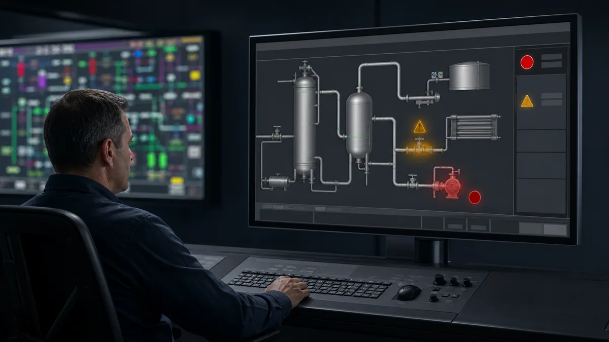
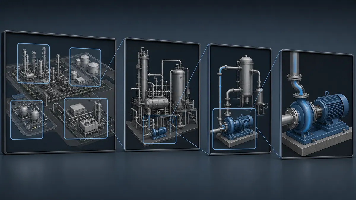
A four-level hierarchy—overview, area, detail, and diagnostic—is a useful implementation pattern, not a universal requirement that every project must copy. Choose the number and purpose of levels from operator roles, process scope, abnormal scenarios, task frequency, and existing site conventions. Validate that operators can recognize a problem, navigate to its cause, take an authorized action, and recover context.
Level 1 — Process Overview
The Level 1 display covers the operator's full responsibility area. Its purpose is rapid global assessment: a representative operator should be able to determine whether the area is normal, what is abnormal, and where to investigate without first navigating away. Define and test the acceptable assessment time for the actual site.
What belongs on a Level 1 display:
- Aggregate equipment status counts (running / stopped / in alarm) per area
- Key throughput metrics and critical process variables rolled up by area
- Active alarm count with highest-priority alarm visible
- Major material or energy flow connectivity — enough to indicate process health, not enough to control
What does not belong on a Level 1 display:
- Individual valve positions
- Detailed trend history
- Control loop faceplates
- Instrument tag values for individual field devices
Every area tile or process block should provide a clear route to the related area display. Test navigation depth with the priority tasks rather than imposing a one-click rule. Information density should support quick status assessment; validate that operators can distinguish normal from abnormal without reading every value.
Level 2 — Area Overview
Level 2 displays cover a defined process area, production line, or equipment group. These are the primary working screens for most operations personnel during steady-state operation. They show process flow, equipment status, key controlled variables, and local alarm context.
Characteristics of an effective Level 2 display:
- Follows actual material and energy flow — left to right, or top to bottom, matching plant geography
- Shows setpoints and process variables for critical control loops in context (not in isolated faceplates)
- Highlights abnormal equipment and out-of-range values through color or shape change
- Provides a consistent, tested route to related equipment detail
- Alarm indication is local — shows alarms within this area, not the global alarm list
Most facilities have between 5 and 20 Level 2 displays depending on plant complexity. The number matters less than ensuring every significant piece of operating equipment appears on exactly one Level 2 screen — ambiguity about which area display "owns" a piece of equipment is a common navigation failure.
Level 3 — Detailed Control
Level 3 displays provide comprehensive information about a single equipment item, control loop, or closely coupled group of loops. These are diagnostic and tuning screens, opened on demand when an operator needs more depth than the area overview provides.
Typical Level 3 content:
- Full control loop faceplate (PV, SP, output, mode, limits)
- Expanded trend for the controlled variable and related variables (30 minutes to 8 hours)
- Interlock and permissive status
- Related upstream and downstream variables for cause-and-effect analysis
- Equipment-specific operational limits and safe operating envelopes
Level 3 screens increase information density because they support focused investigation rather than ambient awareness. Preserve a visible route back to the area context and test it with representative tasks; avoid imposing a universal click count.
Level 4 — Diagnostics and Configuration
Level 4 displays serve engineering, maintenance, and advanced diagnostic functions. They are not operational displays and are not expected to be used during normal process control. Typical examples include loop tuning interfaces, historian-based performance analysis, predictive maintenance dashboards, calibration records, and configuration screens.
Access to Level 4 displays is often permission-gated. Operators in control mode should not be able to inadvertently navigate into tuning or configuration screens. Including Level 4 links in primary navigation menus is a common design mistake that clutters the operator interface with engineering tools.
Practical navigation implication: Map the highest-frequency and highest-consequence operator tasks, then measure how many selections, decisions, and context changes each one requires. A “three-click rule” is not an ISA-101 requirement. The pass condition is that representative operators can reach the needed display, understand their location, and return to context within the site's validated task time.
Color: The ISA-101 Philosophy
The ISA-101 lifecycle expects a documented HMI philosophy and consistent design decisions; it does not supply a universal set of hex codes. Any palette shown here is an illustrative starting point, not text reproduced from the standard or a rule that overrides the site's validated convention.
The Core Principle: Color as an Abnormality Signal
A restrained palette can reserve visual salience for abnormal or actionable states. When saturated color appears everywhere—in equipment outlines, background fills, process-flow lines, and decorative headers—it becomes less useful as an attention mechanism.
The high-performance HMI approach inverts the typical engineering instinct. Rather than showing running pumps in green ("everything is good"), normally operating equipment is rendered in neutral gray tones. Color enters the display only when something requires attention: an alarm fires, a limit is approached, a mode changes, or an operator initiates a control action.
The intended result is a display that is visually calm during steady-state operation and makes abnormality conspicuous through contrast. Validate that outcome with representative operators and realistic normal, transition, and upset scenarios; a grayscale palette alone does not prove faster recognition.
Common Convention: State Indication Colors
The following palette represents widely adopted industry convention — not a color specification mandated by ISA-101. Different facilities and system integrators use variations; what matters is that whatever convention is adopted is applied consistently across every screen in the system.
| State | Common Convention | Notes |
|---|---|---|
| Normal operation (equipment running) | Mid-gray (e.g., #808080 range) | Grayscale base; no green for "normal" |
| Alarm / fault condition | Red family | Critical: higher saturation / flashing |
| Warning / approaching limit | Amber or yellow | Distinguish clearly from alarm red |
| Offline / not in service | Dark gray or outline-only | Recedes from attention |
| Manual / operator control active | Blue family | Distinguishes operator-set from auto |
| Setpoints / target values | Cyan or teal | Separates target from actual measurement |
Critical rule: Never use color as the sole indicator of state. Color-vision deficiency is common enough that every color-coded state should also be communicated through shape, text label, icon, or position. A red pump outline that also shows a fault text label is more robust; a red outline alone is not.
Avoid large areas of saturated “normal” color. If the site's convention uses green for running, use it deliberately and test whether it competes with alarms or abnormal states. A neutral base with a small, redundant state indicator often preserves more attention for conditions that require action.
High Contrast for Legibility
Validate legibility under the real viewing distance, angle, ambient light, glare, display aging, color-vision conditions, and operator task. WCAG contrast ratios are a useful additional check for web-based interfaces, but they do not replace industrial HMI task testing or automatically establish an ISA-101 pass condition. Record the measured contrast and the installed-screen test result instead of relying on a preferred gray hex range.
Alarm Management: KPIs and ISA-18.2 Alignment
The ISA-101 series covers the HMI lifecycle, including display structure, interaction, and usability. The ISA-18 series covers the alarm-management lifecycle, including philosophy, identification, rationalization, implementation, operation, maintenance, monitoring, assessment, audit, and management of change. Use the purchased standards and the site's alarm philosophy as the normative project references.
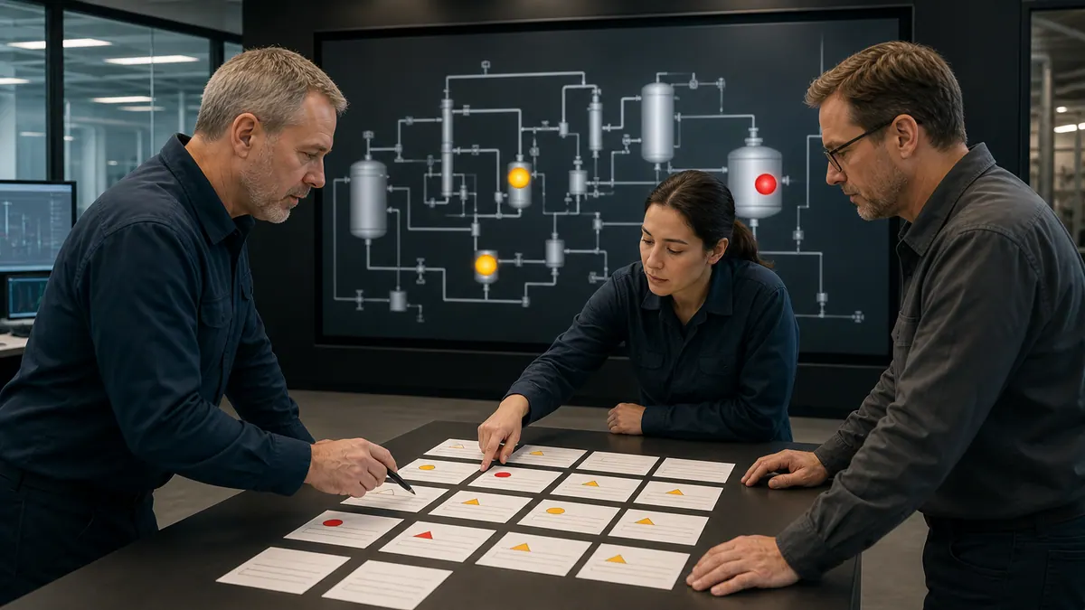
Use performance figures as assessment benchmarks
An official ISA technical article presents example performance metrics calculated over at least 30 days: about 6 annunciated alarms per hour per operator console as “very likely to be acceptable” and about 12 per hour as “maximum manageable.” It also discusses flood exposure using the share of time an operator receives more than 10 alarms in 10 minutes.
These are assessment examples, not universal design limits or proof that an individual operator has enough time to respond. Segment the site's data by operating mode, console, shift, priority, standing/stale state, chattering source, and flood duration. Set project targets in the alarm philosophy, based on actual operator workload and required response.
Alarm priority is a rationalization decision
Do not copy fixed “P1 = one minute” or “P2 = ten minutes” labels into a project. During rationalization, document why the condition needs an alarm, the consequence of no response, the time available, the operator action, setpoint, deadband, delay, priority, suppression rules, and testing evidence. The alarm philosophy defines the site's priority classes and distribution goals. A notification that requires no operator response may belong as an event rather than an alarm.
Standing Alarms
A “standing alarm” remains active beyond the duration defined in the site's alarm philosophy. Track count, age, priority, responsible owner, and recurrence. A large or persistent population can indicate unresolved process conditions, bad actors, disabled equipment, or alarms that need rationalization. Use a site-defined target rather than presenting one universal count.
Standing alarms undermine the entire high-performance HMI approach: if operators habitually see a list of persistent alarms they know to be unactionable, they stop reading alarm lists — and will miss the genuinely critical alarm that appears among them.
Situational Awareness: The Endsley Model Applied to HMI Screen Design
The theoretical backbone of high-performance HMI is Mica Endsley's three-level model of situational awareness (SA), originally developed for aviation and subsequently adopted across process industries, military systems, and emergency response. Understanding this model explains why ISA-101's design principles work — which generic UX guidance consistently lacks.
The Three Levels of Situational Awareness
Level 1 — Perception: The operator correctly perceives the current state of relevant process elements — values, equipment states, alarm conditions. This is the raw sensory input layer. HMI design failures at Level 1 include poor contrast (operator misreads a value), missing data (a critical variable is not displayed), or information overload (the operator cannot locate the relevant element among noise).
Level 2 — Comprehension: The operator integrates perceived information into a meaningful understanding of the current situation — not just "pump P-201 has stopped" but "pump P-201 has stopped and that means reactor feed is dropping." This requires the HMI to present related variables in spatial proximity and temporal context so the operator can see cause-and-effect relationships. Design failures at Level 2 include organizing displays by PLC structure rather than process flow, separating related equipment across different screens, and showing only current values without trend context.
Level 3 — Projection: The operator can predict where the process will be in the near future if no action is taken — "if feed continues dropping at this rate, reactor temperature will reach the low limit in approximately 8 minutes." Level 3 SA requires the HMI to provide trend data, rate-of-change indication, and time-to-limit context. Design failures at Level 3 include displaying only current values with no trend (sparklines, mini-trends, or trend overlays), and alarm systems that only activate when a limit is actually breached rather than providing advance warning as a limit is approached.
Applying the Endsley Model to Display Design Decisions
This framework provides a practical lens for evaluating every design choice:
- Does this element support Level 1 perception? Is the element visible, legible, and distinguishable from its neighbors?
- Does this screen support Level 2 comprehension? Are causally related variables shown together? Does the layout follow process flow?
- Does this screen support Level 3 projection? Does the operator have enough trend context to anticipate where the process is heading?
Most HMI design failures that contribute to incidents can be traced to breakdowns at Level 2 or Level 3. Operators perceive individual data points correctly (Level 1 is intact) but cannot integrate them into a coherent situation picture (Level 2 failure) or predict consequence in time to act (Level 3 failure). High-performance HMI addresses all three levels simultaneously — which is why it represents a methodology rather than a visual style.
Common HMI Mistakes and the ISA-101 Principle That Fixes Each One
The following mistake-and-fix pairs represent the most frequent design failures encountered during HMI audits and modernization projects, each paired with the ISA-101 or ISA-18.2 principle that addresses it.
Mistake 1: P&ID-Mimic Layout
The mistake: Copying the piping and instrumentation diagram directly into the HMI display. The P&ID is an engineering document optimized for completeness and cross-referencing — it shows every instrument, every manual valve, every process connection. Transposing it into an operator display produces screens packed with hundreds of elements at equal visual weight, making it impossible to assess status at a glance.
The ISA-101 fix: Display hierarchy and process-flow organization. Organize displays around operator tasks and process relationships, not instrument enumeration. An area display should prioritize the information needed to recognize and navigate abnormal conditions; detailed displays can expose diagnostics. The P&ID remains an engineering reference and should not simply be copied as the operator display.
Mistake 2: Rainbow Color Schemes
The mistake: Using color throughout the display for equipment outlines, piping, area backgrounds, headers, and graphic decoration. The result is a visually busy interface where the operator's eye has no reliable color signal to follow.
Evidence-led fix: Use a restrained, documented palette so abnormal and actionable states remain salient. A neutral base is a common high-performance implementation, but the exact state colors and redundancies belong in the site philosophy and must be validated with operators.
Mistake 3: Alarm Flooding
The mistake: Configuring alarms on every instrument without rationalization, or setting alarm limits so tight that nuisance alarms fire constantly. When a single process upset triggers hundreds of consequential alarms simultaneously, operators cannot identify the root cause or the critical safety conditions within the noise.
Lifecycle fix: Apply the site's ISA-18.2-aligned alarm philosophy, rationalization records, priorities, and approved state-based techniques. Present alarm state with enough process context for the operator's response task, and verify suppression, shelving, annunciation, acknowledgment, and recovery scenarios.
Mistake 4: No Visual Hierarchy (Everything Equal Weight)
The mistake: Displaying all variables at the same size, color weight, and visual prominence. An alarm count appears the same size as a minor engineering note. A critical temperature has the same visual weight as a non-critical auxiliary pressure.
The ISA-101 fix: Display hierarchy and abnormality emphasis. ISA-101's high-performance HMI principles explicitly address the use of size, contrast, and position to create hierarchy. The more consequential the information, the more visual prominence it receives. Abnormal conditions should be immediately and unmistakably distinguishable from normal conditions — that is the purpose of the grayscale-base, color-for-abnormal approach.
Mistake 5: Alarm List as the Primary Awareness Tool
The mistake: Designing the HMI so that the primary way operators understand plant state is by reading the alarm list. This places the cognitive burden entirely on the operator: they must mentally map each alarm tag to its physical location, infer the process impact, and reconstruct the situation from a list of individual data points.
Task-based fix: Give operators a tested route from annunciation to the affected process context, related variables, response guidance, and authorized action. Whether an alarm state appears on every overview is a design decision recorded in the HMI and alarm philosophies, not a universal layout rule.
ISA-101 HMI Design Checklist
Use this checklist as a quick audit tool during design reviews or system acceptance testing. It is structured around the ISA-101 high-performance HMI principles most commonly violated in practice.
Display Hierarchy
- Level 1 overview displays the complete facility/unit on one screen without scrolling
- Level 1 to Level 2 navigation meets the validated priority-task criteria
- Every piece of operating equipment appears on exactly one Level 2 area display
- Relevant equipment details are reachable consistently from Level 2 displays
- Level 4 diagnostic screens are permission-gated and not in the primary operator navigation
- Priority operator tasks meet the site's validated navigation and completion-time criteria
Color Philosophy
- Normally operating equipment is represented in neutral gray tones
- Green is NOT used as the default color for running/normal equipment
- Color appears exclusively for alarm states, warnings, manual mode, and operator-selected items
- No element uses color as its sole indicator of state (text, shape, or icon also communicates state)
- Red-green distinction is not required to distinguish any two critical states (color-blindness check)
- Color palette is consistent — same color means the same thing on every screen
Alarm Quality
- All configured alarms have been rationalized (documented necessity, priority, limits, and operator response)
- Alarm-rate and flood-exposure targets are documented in the site alarm philosophy
- Standing and stale alarms are tracked by age, priority, source, and owner
- State-based suppression prevents consequential alarm floods during known upsets
- Alarm states are visible on process graphics (area overview), not only in the alarm list
- Critical (P1) alarms are rare by design — if P1 alarms fire daily, rationalization is needed
Situational Awareness (Endsley Levels)
- Level 1 — key variables are visible, legible, and unambiguous on the primary working screen
- Level 2 — causally related equipment is shown in spatial proximity following process flow
- Level 3 — trend context (sparkline, mini-trend, or rate-of-change indicator) is available for critical variables without navigating to a separate trend screen
- Process flow direction matches conventional plant layout (not PLC or database organization)
ISA-101 Standards for HMI Design
ANSI/ISA-101.01 addresses human-machine interfaces for process automation systems. It is distinct from IEC 62381. Use a licensed copy of the applicable standard and the site's HMI philosophy to establish project criteria, then verify those criteria with operators and documented tests.
High Performance HMI Principles
Situational awareness philosophy emphasizes providing operators with clear understanding of current conditions, recent history, and likely future developments. High performance HMI design focuses on enabling operators to anticipate problems and take proactive action rather than simply reacting to alarms and upsets.
Abnormality detection principles state that HMI systems should highlight deviations from normal conditions while suppressing information about equipment operating normally. Operators should immediately recognize abnormal situations through clear visual indication rather than searching through data to identify problems.
Process flow organization arranges displays to follow material and energy flow through the process, matching operator mental models of how the plant operates. Flow-based organization improves comprehension and accelerates problem identification compared to arbitrary equipment groupings.
Alarm management integration ensures that alarm information is presented in context with process graphics, trends, and diagnostic information rather than isolated in separate alarm lists. Contextual alarm presentation helps operators understand alarm causes and appropriate responses.
Display Navigation Philosophy
One practical four-level hierarchy includes:
Level 1: Overview Display - A screen summarizing the operator's responsibility area with the information needed to distinguish normal from abnormal operation and select the next investigation. Validate assessment time and comprehension with representative operators.
Level 2: Process Area Displays - Detailed views of specific process sections, production lines, or equipment groups showing process flow, equipment status, key variables, and local alarm information. Area displays provide the primary working screens for most operator activities.
Level 3: Equipment Detail Displays - Comprehensive information about individual equipment items including control faceplates, detailed status, diagnostic information, maintenance data, and historical trends. Detail displays support troubleshooting and optimization activities.
Level 4: Diagnostic and Analytical Displays - Specialized screens for advanced diagnostics, performance analysis, historical review, or maintenance functions. Level 4 displays typically target engineering and maintenance users rather than operations personnel.
Graphics and Visualization Standards
Minimalist graphics remove decorative elements, 3D effects, photorealistic imagery, and detail that does not support an operator task. Validate the simplified display against normal, transition, upset, and diagnostic scenarios so useful process context is not removed along with decoration.
Grayscale for normal operation reduces visual stimulation during stable conditions, allowing color to be reserved for highlighting abnormal situations. Equipment operating normally appears in neutral gray tones, while running equipment, alarms, and operator interactions use color to draw attention.
Strategic color usage limits color to specifically indicate equipment states, alarm conditions, and operator actions rather than using color throughout displays. Restricted color palettes prevent desensitization where excessive color use reduces effectiveness of color as an attention-drawing mechanism.
Animation standards specify that animation should indicate process variables, material flow, equipment motion, or state changes rather than serving decorative purposes. Purposeful animation enhances understanding while excessive animation distracts operators and consumes system resources. Explore advanced HMI animation techniques in our HMI programming tutorial.
Alarm Philosophy Integration
Alarm prioritization schemes classify alarms by urgency and consequence, ensuring that critical alarms receive immediate attention while less urgent notifications don't overwhelm operators. ISA-18.2 alarm management standards provide detailed guidance on establishing effective priority schemes.
Alarm rationalization processes evaluate every configured alarm to ensure necessity, proper priority, appropriate limits, and clear operator response procedures. Effective rationalization eliminates nuisance alarms while ensuring that critical conditions always generate alarms.
Alarm suppression during startup, shutdown, and known upset conditions prevents alarm floods that overwhelm operators when they're already managing abnormal situations. Conditional alarm logic and state-based suppression reduce alarm rates while maintaining safety.
Alarm visualization in HMI displays uses clear color coding, position, and size to distinguish alarm priorities and guide operator response. Critical alarms should be unmistakable while lower priority notifications remain visible without dominating operator attention.
Live mini-lab
Try it: press START, then STOP
A stop-dominant seal-in rung: START latches the motor output through its own contact, and STOP breaks the circuit.
Watch the output lamp: it stays on after START until you press STOP.
Free to start · runs in your browserOpens plcsimulationsoftware.com — same team
Color Usage and Psychology in HMI Design
Color represents one of the most powerful yet frequently misused elements in HMI design. Strategic color implementation following established conventions and human factors principles dramatically improves operator performance, while poor color choices create confusion, fatigue, and dangerous misinterpretation of process conditions.
Create a Site Color and State Matrix
Do not copy a universal color table into a live system. Build a state matrix in the HMI philosophy and test it against the installed displays and actual tasks:
| State or information class | Visual channels to define | Acceptance evidence |
|---|---|---|
| Normal running, stopped, unavailable | Base tone plus text, symbol or pattern | Operators distinguish each state without relying on hue |
| Alarm by approved priority | Salient color plus priority text/icon and annunciation state | Scenario test covers new, acknowledged, returned and shelved states |
| Manual, override, bypass or inhibited | Persistent redundant indicator | Operator can identify who/what owns the state |
| Setpoint, actual value and limit | Label, position, typography and optional color | Values remain distinct in reduced-color and glare tests |
| Bad, stale, uncertain or substituted data | Quality marker plus text or symbol | Communication-loss and stale-data tests are unambiguous |
Use exact colors only after measuring contrast and checking the full state set together. A color can be locally consistent and still fail if alarm, bad-quality, selection, maintenance, and equipment-state indications compete for the same visual channel.
Color Contrast and Accessibility
Measure contrast as one input, then verify character height, stroke, spacing, glare, luminance, viewing angle, display condition, and task performance on the installed hardware. For a browser-delivered HMI, WCAG's 4.5:1 normal-text and 3:1 large-text criteria can provide a useful web-accessibility check; they are not a substitute for the project's industrial human-factors acceptance criteria.
Choose background luminance from the room and workstation conditions rather than a generic dark-gray range. Test day, night, emergency lighting, reflections, dimming, and adjacent screens.
Color-vision considerations require that color is never the sole indicator of equipment status or alarm conditions. Supplement color with shape, position, text labels, or icons and validate the result with representative users.
Lighting condition adaptations account for variations in ambient lighting between day and night shifts, summer and winter sun angles, and different control room configurations. Adjustable brightness, automatic adaptation, or alternative color schemes maintain display readability across varying environmental conditions.
Color Psychology in Industrial Environments
Do not justify state colors through broad claims about universal color psychology. Use the facility's established conventions, applicable requirements, color-vision checks, and operator tests. Reserve the most salient combinations for the highest-consequence actionable states, and ensure every meaning survives monochrome or reduced-color viewing.
Common Color Usage Mistakes to Avoid
Excessive Color Usage: Displays using rainbow color schemes for decorative purposes create visual chaos that makes identifying actual alarms and abnormal conditions extremely difficult. Limit color to operationally meaningful indications.
Inconsistent Color Application: Using red for running equipment in some areas and stopped equipment in others, or varying green/gray conventions between screens creates dangerous confusion. Establish color standards and enforce them rigorously.
Low Contrast Combinations: Yellow text on white backgrounds, light gray on dark gray, or subtle color variations that operators cannot distinguish reliably under stress. Test color combinations under actual operating conditions including various lighting scenarios.
Cultural Color Assumptions: Color associations and established plant conventions vary. Include the actual operator population in review and never rely on color alone.
Insufficient Color Testing: Failing to test color schemes with actual operators including those with color vision deficiencies, under various lighting conditions, and on actual display hardware rather than design workstations. Production displays often appear significantly different than design monitors.
Typography and Readability Best Practices
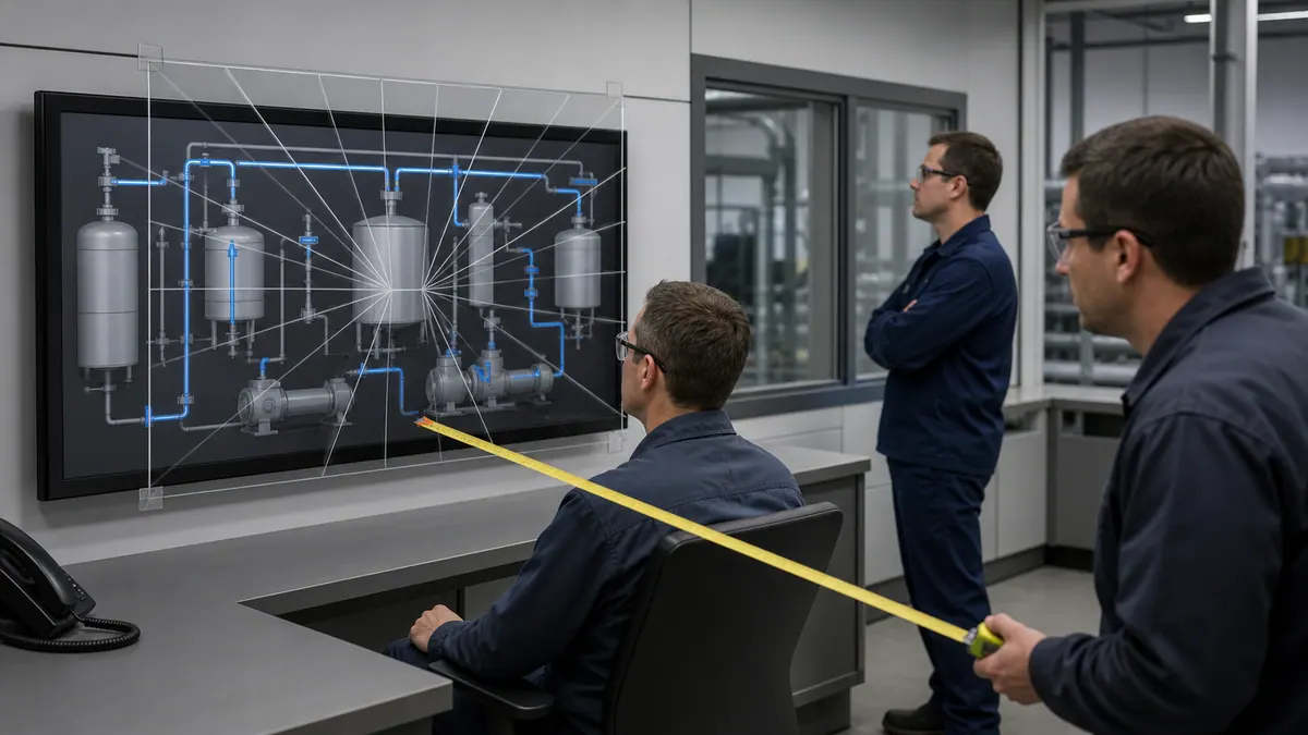
Text readability in HMI systems directly impacts operator ability to quickly and accurately interpret process information, alarm messages, and equipment status. Typography choices including fonts, sizes, weights, and formatting significantly influence operator performance and fatigue levels.
Font Selection Guidelines
Sans-serif fonts including Arial, Helvetica, Verdana, and Calibri provide superior readability on digital displays compared to serif fonts designed for print media. Clean, simple letter forms without decorative serifs reduce visual clutter and improve character recognition at various sizes and viewing distances.
Monospaced fonts like Courier or Consolas work well for displaying numerical data, alarm lists, and tabular information where column alignment is important. However, proportional fonts are more readable for labels, descriptions, and longer text passages.
Font consistency throughout the HMI system means using one primary font for all normal text, potentially one alternative font for special purposes (data entry, tabular data), and avoiding the temptation to use multiple decorative fonts that create visual chaos.
System fonts installed on all HMI servers and client workstations prevent display problems when HMI applications run on different computers. Custom or specialty fonts may appear incorrectly or be substituted with default fonts if not available on all systems.
Text Size and Scaling
Specify text by rendered character height and legibility on the target display, not by document points alone. Viewing distance, pixel density, font, luminance, glare, operator position, and task criticality all affect the result. Test the smallest labels and values on the installed hardware with representative users and record the accepted style tokens.
Hierarchical text sizing uses larger sizes for more important information and smaller sizes for supporting detail. Equipment labels might be 14-point, current process values 18-point, and alarms 20-point to create clear visual hierarchy that guides operator attention.
Scalability for different displays means testing text appearance on all display sizes and resolutions used in the facility. Text that appears clear on 24-inch 1920x1080 displays might be uncomfortably large on 55-inch video walls or illegibly small on mobile devices.
Text Formatting and Style
All Caps vs Mixed Case: Studies consistently show that mixed-case text is more readable than ALL CAPITALS text because word shapes aid recognition. Reserve ALL CAPS for very short labels or special emphasis, not for general use.
Bold vs Regular Weight: Bold text draws attention and improves readability of critical information but becomes visually heavy when overused. Use bold selectively for equipment labels, alarm messages, and important headings rather than all text.
Italic Text: Avoid italics in HMI displays except for specific purposes like indicating calculated values or offline data. Italics reduce readability on digital displays and slow reading speed.
Underlined Text: Underlining typically indicates clickable links in modern interfaces. Use underlines consistently for this purpose or avoid them entirely to prevent confusion about what is clickable.
Text Colors: Ensure sufficient contrast between text and backgrounds (minimum 4.5:1 ratio). White or light yellow text on dark backgrounds works well. Avoid colored text except where color conveys specific meaning (red alarm text, green status messages).
Label Design Best Practices
Equipment labels should match physical asset tags, P&ID identifiers, or common operational names rather than database tags or PLC addresses. Operators need to correlate HMI displays with physical equipment, maintenance records, and procedures.
Abbreviation standards prevent confusion by using consistent, documented abbreviations throughout the system. Create an abbreviation dictionary and enforce its use rather than allowing individual developers to create ad-hoc abbreviations.
Meaningful descriptions supplement short labels with clear explanation of equipment function, control strategy, or alarm significance. Operators shouldn't need to memorize cryptic codes or consult manuals to understand what equipment does.
Multi-language support for facilities with diverse workforces requires careful planning for text space, translation accuracy, and technical terminology. Languages like German produce longer words than English, potentially causing layout problems if not anticipated during design.
Layout, Spacing, and Visual Hierarchy
Screen layout and spatial organization fundamentally determine how effectively operators can extract meaning from HMI displays. Thoughtful layout reduces search time, minimizes errors, and creates intuitive interfaces that operators can use efficiently even during stressful situations.
Grid-Based Layout Principles
Alignment on consistent grid systems (8-pixel, 12-pixel, or 16-pixel grids) creates visual order and professional appearance. Grid-aligned elements appear deliberate and organized while randomly positioned elements look amateurish and confusing.
Consistent spacing between elements using multiples of base grid units (8px, 16px, 24px, 32px, 48px) establishes visual rhythm and relationship grouping. Related elements should have smaller spacing while unrelated elements need larger gaps to indicate separation.
Margin and padding standards ensure adequate whitespace around the perimeter of screens and around major display sections. Crowding information to screen edges makes displays feel cramped and difficult to parse. Minimum 16-32 pixel margins provide breathing room.
Responsive grid systems adapt to different screen sizes while maintaining visual relationships and proportions. Multi-column layouts might shift to single column on smaller displays, but relative positioning and grouping should remain consistent.
Visual Hierarchy Implementation
Size hierarchy uses larger elements for more important information and smaller elements for supporting details. Alarm counts should be larger than equipment counts. Current process values should be larger than min/max ranges. Main navigation should be larger than secondary controls.
Color hierarchy (as discussed earlier) uses color to draw attention to abnormal conditions while neutral tones recede into the background. The eye naturally focuses on color in grayscale environments.
Position hierarchy places important information in predictable locations where operators look first—typically upper left for Western cultures, center screen for critical alarms, consistent locations for navigation. Operators develop muscle memory for finding key information.
Contrast hierarchy uses sharp contrast for critical elements and lower contrast for background information. High-contrast elements (black on white, white on dark gray) demand attention while similar-value combinations (light gray on medium gray) fade to the background.
Whitespace and Grouping
Proximity grouping uses whitespace to visually connect related elements while separating unrelated information. Controls for a specific pump should be grouped together with minimal spacing. Different equipment groups should have clear separation with larger whitespace gaps.
Use enough whitespace to separate functional groups and preserve a clear scan path. A fixed percentage is not universal; validate density at the real display size and viewing distance with representative operator tasks.
Containment using subtle borders, background shading, or panels clearly delineates different functional areas without creating visual clutter. Light gray panels (#E8E8E8) on darker backgrounds (#606060) effectively group related information.
Visual breathing room around interactive elements (buttons, dropdowns, sliders) prevents accidental activation while improving usability for touch interfaces. Minimum 8-pixel spacing around controls supports both mouse and touch interaction.
Screen Organization Patterns
F-Pattern Layout: Research on eye tracking shows that Western operators scan screens in an F-pattern—across the top, down the left side, then across middle sections. Place critical information along these paths for fastest recognition.
Z-Pattern Layout: For screens with less text and more graphics, operators follow Z-pattern scanning. Top-left to top-right, diagonal down, then left-to-right across bottom. Organize key information following this natural eye movement.
Dashboard Grid Layout: Overview screens often use dashboard-style grids showing KPIs, equipment status summaries, and alarm counts in organized tiles. Consistent tile sizes and grid alignment create scannable layouts.
Process Flow Layout: Detail screens typically follow process flow from input to output, left to right or top to bottom. Material flow direction matches visual layout direction for intuitive understanding.
Alarm Management and Visualization
Effective alarm management represents one of the most critical aspects of HMI design, directly impacting operator response during the abnormal situations where proper HMI design matters most. Poor alarm design overwhelms operators when they most need clear guidance, while well-designed alarm systems provide focused, actionable information.
Alarm Philosophy and Prioritization
Priority-rationalization record:
| Field | Question to answer |
|---|---|
| Alarm basis | What abnormal condition requires an operator response? |
| Consequence | What happens if the operator does not respond? |
| Available time | How much time exists after detection, based on process evidence? |
| Corrective action | What specific action can the operator take? |
| Priority | Which site-defined class follows from consequence and time? |
| Configuration | What setpoint, deadband, delay, latching, and suppression rules are justified? |
| Verification | Which scenario proves detection, annunciation, action, and recovery? |
Alarm-flood prevention starts with rationalization, bad-actor removal, state-based design where justified, and ongoing monitoring. Compare measured rates and flood exposure with the targets in the site's alarm philosophy; do not treat one average rate as proof that all upset periods are manageable.
Alarm Visualization Best Practices
Priority Presentation: Map each approved alarm priority to a redundant combination of text, icon, position, audible behavior, and color in the alarm philosophy. Do not infer priority from an arbitrary red/amber palette. Test new, unacknowledged, acknowledged, returned-to-normal, shelved, suppressed, and bad-quality states.
Visual Urgency Indicators: Use flashing only where the alarm philosophy, platform capability, accessibility review, and operator test justify it—commonly to distinguish a new or unacknowledged state rather than to encode consequence by itself. Document the selected frequency and duty cycle and assess photosensitive-seizure risk against the applicable interface guidance; this guide does not prescribe a universal flash rate.
Alarm Banners and Annunciators: Define where global alarm awareness is required and provide a consistent, tested route to the alarm summary and affected process context. The persistent information can vary by display role; prove that an operator can detect a new alarm and retain context during the representative scenario.
Contextual Alarm Display: Process graphics should clearly indicate alarmed equipment through color changes, flashing, or other visual indicators. Operators should be able to identify alarmed equipment without consulting separate alarm lists. Learn more about integrating alarms with PLC programming.
Alarm Sound Design
Audible annunciation should be designed from the alarm philosophy, ambient-noise survey, workstation layout, simultaneous-alarm behavior, and hearing-access needs. If tones differ, validate that operators can distinguish them in realistic conditions without creating confusion or alarm fatigue.
Define who may silence or adjust annunciation, what acknowledgment changes, how disabled sound is indicated, and how visual state persists. Test loss of audio hardware and high-noise conditions.
Hearing impairment considerations include visual-only alarm indication (flashing screens, lights) for operators with hearing loss or in high-noise environments where audible alarms may not be heard reliably.
Alarm List Design and Filtering
Essential Alarm List Columns:
- Priority indicator (color-coded)
- Timestamp (date and time alarm occurred)
- Equipment/area identification
- Alarm description (clear, action-oriented)
- Alarm value and limit if applicable
- Acknowledgment status
- Time in alarm duration
Alarm Filtering Capabilities: Provide filters that match the operator's real investigation tasks—such as priority, area, state, equipment, and time—and preserve awareness of hidden results. Measure whether representative operators can isolate active or unacknowledged alarms without losing the broader upset context.
Alarm Suppression Indication: Suppressed alarms (due to mode, maintenance, or process state) should be clearly indicated in alarm lists with explanations of why suppression is active. Hidden suppressed alarms create dangerous blind spots.
Alarm Response Guidance
Embedded response procedures displayed when operators select alarms provide immediate access to correct response actions without searching paper manuals. Short action lists (3-5 steps) embedded in alarm details guide proper response.
Equipment context links can take operators from an alarm row to the affected process and related variables. Test the full path and return behavior; do not assume that a fixed click count proves faster response.
Alarm help should state the condition, consequence, expected operator response, available response time, and approved references at a depth appropriate to the task. Validate comprehension instead of imposing a universal sentence count.
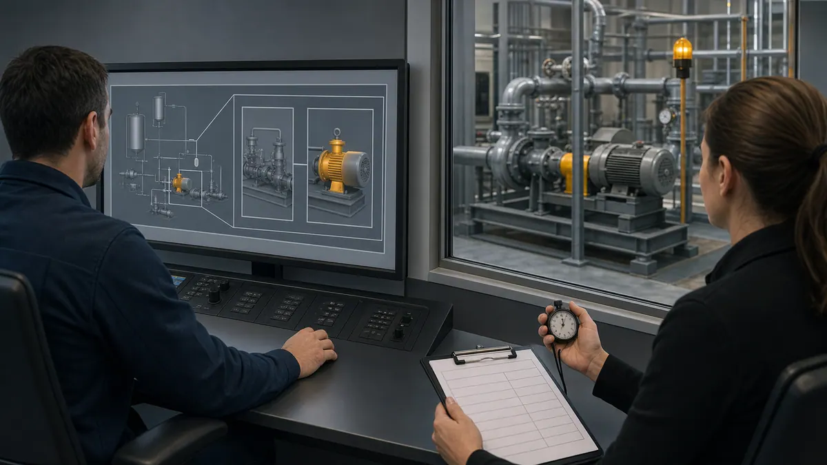
Navigation and User Experience Design
Intuitive navigation structures enable operators to find needed information quickly while maintaining awareness of overall system status. Poor navigation forces operators to search through multiple screens during critical situations, degrading response time and situational awareness.
Navigation Architecture
Primary Navigation Methods:
- Global navigation bar present on every screen with consistent location
- Breadcrumb trails showing current location in display hierarchy
- Overview-to-detail drill-down following ISA-101 four-level hierarchy
- Direct access to frequently used screens via favorites or quick links
- Search functionality for large systems with hundreds of displays
Consistent Navigation Placement: Top navigation bars or left-side navigation panels should occupy identical screen positions on every display. Operators shouldn't search for navigation controls or adapt to varying layouts between screens.
Home Button Prominence: A consistent return to overview should be available from every relevant screen. Validate its label, placement, access control, and behavior during developing situations.
Breadcrumb Navigation: Hierarchical breadcrumbs (Overview > Area 3 > Reactor R-301 > Detail) show current location and enable upward navigation through display hierarchy. Clickable breadcrumbs support rapid level changes.
User Interaction Design
Click vs Double-Click: Use consistent activation patterns and avoid making time-critical actions depend on a difficult gesture. Separate selection from consequential command execution where the risk assessment requires confirmation, authorization, or a press-and-hold pattern.
Hover Behaviors: Tooltips on hover provide additional information without cluttering displays. Equipment symbols can show nameplate data, current status, or trends on hover. However, critical information should never depend solely on hover states.
Context Menus: Right-click context menus provide access to secondary functions (trends, details, diagnostics) without cluttering displays with buttons. Consistent context menu content across similar equipment types improves usability.
Touch Interface Considerations: Size and separate touch targets from the installed panel's physical dimensions, resolution, viewing distance, glove use, vibration, reach, and consequence of a wrong selection. Web guidance such as a 44-CSS-pixel target is a useful starting check for browser interfaces, not a universal industrial-HMI acceptance criterion.
Faceplate Design
Standard Faceplate Components: Control loop faceplates should consistently include:
- Process variable with engineering units
- Setpoint (local and remote if cascade)
- Output value and percentage
- Mode indication (auto/manual/cascade)
- High/low limits
- Tuning parameters (accessible but not prominent)
- Mini-trend showing recent behavior
Faceplate Interaction: Clicking equipment symbols should open standard faceplates in consistent locations (typically center screen or right panel) without navigating away from process context. Modal faceplates maintain process graphic visibility while enabling control operations.
Control Actions: Setpoint changes, mode changes, and output adjustments should require deliberate actions with clear confirmation. Critical controls (emergency stops, large changes) should require two-step confirmation to prevent accidents.
Mobile Navigation Considerations
Simplified navigation for mobile devices recognizes touch interface constraints and smaller screens. Hamburger menus, swipe gestures, and touch-optimized controls replace mouse-dependent interactions.
Responsive layouts adapt navigation structure to available screen size. Multi-column layouts on large displays become single-column on phones. Persistent navigation on large screens might collapse to expandable menus on small displays.
Offline capabilities enable mobile HMI access even when network connectivity is intermittent. Cached data and local storage prevent complete loss of functionality during connection drops. Explore mobile HMI development in our comprehensive HMI programming guide.
Data Visualization Best Practices
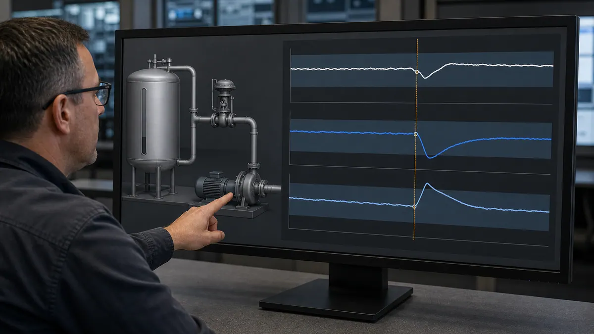
Effective data visualization transforms raw process data into meaningful information that supports operator decision-making. Well-designed visualizations reveal patterns, trends, and relationships that aren't apparent in numerical displays while poor visualization obscures important information.
Trend Chart Design
Time Scale Selection: Provide multiple time scales (15 minutes, 1 hour, 8 hours, 24 hours, 7 days) rather than arbitrary or fixed ranges. Different troubleshooting and optimization tasks require different time perspectives.
Y-Axis Scaling: Auto-scaling trends can obscure small but significant changes when large disturbances expand scale. Fixed scaling based on normal operating ranges maintains consistent perspective but may clip excursions. Provide both options with clear indication of active mode.
Multiple Pens: Color-code trend pens consistently across all trends. When displaying correlated variables (PV, SP, Output), use standard colors. Limit to 4-6 pens maximum to maintain readability.
Reference Lines: Show setpoints, limits, targets, or normal ranges as reference lines that provide context for current values. Reference lines should use lighter colors or dashed patterns to distinguish from actual data.
Gauge and Meter Design
Avoid Skeuomorphic Designs: Photorealistic gauge faces, 3D dials, and elaborate analog meter recreations waste screen space while providing no advantage over simple bar graphs or numerical displays. Reserve elaborate gauges for specialized applications where they add genuine value.
Bar Graph Effectiveness: Horizontal or vertical bar graphs provide clear indication of current value relative to range. Color-code bars to show normal (green), warning (yellow), and alarm (red) regions. Include numerical value for precision.
Segmented Indicators: LED-style segmented displays effectively show discrete levels or ranges. Tank level indicators with color-coded segments (green for normal, yellow for low, red for critical) provide quick visual assessment.
Gauge Placement: Group related gauges logically rather than scattering them across displays. All flow measurements in a section might appear together for rapid scanning.
Table and List Design
Zebra Striping: Alternating row background colors (white/light gray) improve readability of multi-row tables by helping eyes track across rows. Use subtle color difference to avoid creating visual noise.
Sortable Columns: Enable column sorting for lists and tables so operators can organize data by priority, time, value, or other criteria relevant to their current task. Indicate sort column and direction clearly.
Highlight Abnormal Values: Use color or bold text to highlight values outside normal ranges in tables. Large equipment status tables should make abnormal conditions obvious without requiring detailed scanning.
Column Selection: For large data tables, allow operators to show/hide columns and adjust column order to match their workflow preferences while maintaining core essential columns.
KPI Dashboard Design
Metric Selection: Display truly key performance indicators rather than overwhelming operators with every available metric. Focus on metrics that drive operational decisions: production rate, quality parameters, efficiency ratios, critical setpoints.
Threshold Indicators: Color-code KPIs based on performance against targets. Green for meeting targets, yellow for approaching limits, red for unacceptable performance. Include actual values and target values.
Trend Sparklines: Small embedded trend charts (sparklines) next to KPI values show recent behavior and direction without requiring dedicated trend displays. Rising/falling indicators quickly convey performance trajectory.
Comparative Displays: Show current shift performance vs. previous shift, current production vs. target, or current vs. best-ever performance to provide context. Simple percentage comparisons (98% of target) communicate effectively.
Responsive Design for Different Screen Sizes
Modern industrial environments include diverse display types from large video walls to tablet devices, requiring HMI designs that adapt gracefully to various screen sizes and resolutions while maintaining usability and information hierarchy.
Screen Size Categories
Large Format (50"+ Video Walls): Overview displays for control room walls should use larger fonts, bold graphics, and high-contrast colors visible from 10-20 feet away. Emphasize system-wide status and critical alarms rather than detailed control.
Standard Desktop (21-27" Monitors): Primary operator workstations typically use this range. Standard HMI designs should optimize for 1920x1080 or 2560x1440 resolution with comfortable viewing from 24-30 inches.
Industrial Panel PCs (12-21" Touchscreens): Field operator interfaces mounted on equipment need touch-optimized controls, simplified screens, and larger touch targets. Viewing distances vary from 18-36 inches.
Tablets (7-12" Mobile Devices): Mobile maintenance and supervisory access requires streamlined interfaces, essential information only, and touch-first interaction design.
Smartphones (4-6" Screens): Alarm notification, basic monitoring, and emergency access only. Full operational control should not depend on smartphone interfaces.
Responsive Layout Strategies
Fluid Grids: Layout elements using percentage widths rather than fixed pixels enable designs to scale proportionally across screen sizes. A sidebar might be 25% width on large screens and 100% width (full screen) on small displays.
Breakpoint-Based Layouts: Define specific layouts for different screen width breakpoints:
- Extra Large: > 1920px (video walls, multi-monitor setups)
- Large: 1280-1920px (standard desktops)
- Medium: 768-1280px (tablets, small monitors)
- Small: < 768px (phones, small tablets)
Progressive Disclosure: Show all information on large displays but progressively hide less critical details on smaller screens. Overview displays might show alarm counts on large screens but only critical alarm count on phones.
Orientation Adaptation: Design for both landscape (typical) and portrait orientations. Some panel mount installations use portrait orientation. Tablet users switch between orientations.
Resolution Independence
Vector Graphics: Use SVG (Scalable Vector Graphics) rather than raster images for equipment symbols, icons, and graphics that need to scale without quality loss. Vector graphics remain sharp at any resolution or zoom level.
Relative Sizing: Specify dimensions in relative units (em, rem, percentages) rather than absolute pixels where possible. This enables better scaling across different displays and zoom levels.
High-DPI Support: Modern displays include 4K and retro displays with very high pixel density. Ensure graphics and text appear sharp on high-DPI displays through proper scaling and vector graphics.
Zoom Capability: Provide zoom controls for operators with visual impairments or when small details need examination. Zoom should maintain layout integrity rather than creating horizontal scrolling.
Performance Optimization for Different Devices
Update Rate Adaptation: Reduce update frequency on mobile devices with limited processing power or bandwidth. Desktop displays might update at 1 Hz while mobile clients update at 0.1-0.5 Hz to conserve resources.
Graphics Complexity: Simplify graphics for mobile devices—eliminate animations, reduce color gradients, minimize transparency effects. Mobile GPUs have less power than desktop GPUs.
Data Filtering: Mobile interfaces should request only essential data rather than complete tag databases. Server-side filtering reduces network traffic and client processing requirements.
Accessibility Considerations for HMI Design
Accessible HMI design ensures that operators with various abilities can use systems effectively while improving usability for all operators through clarity, consistency, and thoughtful design choices.
Visual Accessibility
Color Blindness Accommodation: Never use color alone to convey critical information. Supplement color with text labels, icons, position, or shape and test the display in reduced-color conditions.
High Contrast Modes: Provide high-contrast display modes for operators with low vision. Black backgrounds with white/yellow text or white backgrounds with black text offer maximum contrast. Allow user selection of preferred mode.
Adjustable Font Sizes: Where the platform supports it, let operators increase text size without clipping controls, hiding units, or changing the meaning of the display. Verify the largest supported setting on every reusable component and priority screen.
Screen Reader Compatibility: While less common in HMI systems, screen reader support enables visually impaired personnel to access alarm information and system status. Proper HTML markup and ARIA labels support screen readers in web-based HMI systems.
Motor Accessibility
Large Click Targets: Operators with motor-control difficulties may need larger targets, more spacing, alternative input, or adjusted dwell behavior. Determine physical target size from the installed device and validate it with the intended users, including gloves or assistive technology where relevant.
No Double-Click Dependencies: Double-click actions prove difficult for users with motor impairments. Avoid double-click requirements or provide single-click alternatives.
Keyboard Navigation: Complete keyboard navigation support helps operators who cannot use mice precisely. Tab order should follow logical screen reading order. All controls should be keyboard-accessible.
Dwell Time Adjustments: For touch interfaces, provide adjustable dwell times for operators who cannot tap quickly or accurately. Longer touch dwell prevents accidental activation.
Cognitive Accessibility
Consistent Patterns: Consistent navigation, interaction patterns, and visual design reduce cognitive load for all operators, particularly those with cognitive impairments or learning disabilities.
Clear Language: Use plain language in labels, instructions, and alarm messages. Avoid jargon, abbreviations, and complex technical terms where simpler alternatives exist.
Error Prevention: Design interfaces to prevent errors rather than requiring error recovery. Confirmation dialogs for critical actions, valid input ranges, and logical control organization prevent mistakes.
Memory Aids: Embedded help text, hover descriptions, and contextual information reduce dependence on memory. Operators shouldn't need to remember complex procedures or codes.
Performance Optimization for HMI Systems
HMI system performance directly impacts operator effectiveness through screen update rates, navigation responsiveness, and overall system reliability. Poor performance creates frustration and can delay critical responses during abnormal situations.
Update Rate Optimization
Appropriate Scan Rates: Configure update rates based on process dynamics. Fast processes (motion control, high-speed packaging) might need 100-500ms updates. Slow processes (temperature control, batch reactions) work fine with 1-5 second updates.
Priority-Based Updates: Critical displays and alarm information should update more frequently than historical trends or diagnostic screens. Allocate system resources to support the most important real-time data.
On-Screen Update Optimization: Only update visible screen elements. Background screens or minimized windows shouldn't consume resources updating invisible data. Pause updates when screens aren't visible.
Network Bandwidth Management: In distributed HMI systems, manage network bandwidth by updating only changed values (exception-based updates), compressing data, or reducing update frequency for non-critical data.
Graphics Performance
Animation Limits: Excessive animation overloads graphics processors and creates visual fatigue. Limit simultaneous animations to essential process indications (motor rotation, material flow).
Transparency Effects: Transparency, gradients, and layered graphics consume significant graphics processing resources. Use sparingly and test performance on actual target hardware.
Image Optimization: Compress image files appropriately. Use PNG for graphics with sharp edges and text. Use JPEG for photographs. Avoid unnecessarily large images that waste memory and load time.
Graphics Caching: Cache static graphics elements rather than redrawing constantly. Separate dynamic elements (changing values, colors) from static backgrounds for efficient updates.
Database and Historian Performance
Tag Database Optimization: Well-structured tag databases with logical naming, appropriate data types, and organized hierarchies improve query performance and reduce database load.
Historian Query Optimization: Limit historical data queries to reasonable time ranges and sample counts. Querying millions of data points for trend displays overloads systems. Use data reduction or averaging for long time periods.
Archive Management: Regularly archive historical data to separate storage to maintain active database performance. Keep recent data (30-90 days) in fast online storage; archive older data to slower storage with longer query times.
Client Performance
Workstation Hardware Requirements: Specify appropriate client hardware based on HMI complexity. Simple systems might run on basic industrial PCs. Complex graphics-heavy systems need dedicated GPUs and substantial RAM.
Resource Monitoring: Monitor client CPU, memory, and network utilization to identify performance bottlenecks. High CPU usage might indicate excessive animation or calculation scripts. Memory leaks cause degrading performance over time.
Startup Performance: Optimize application startup time through lazy loading, background initialization, and streamlined startup sequences. Operators need access to critical displays quickly after workstation restarts.
Security Considerations in HMI Design
Cybersecurity threats targeting industrial control systems require thoughtful security measures integrated throughout HMI design without compromising usability or operational effectiveness. Learn more about secure PLC communications.
Access Control Design
Role-Based Permissions: Different operators, engineers, and administrators need different access levels. Design interfaces that hide or disable controls based on user permissions. Operators shouldn't see engineer-only functions.
Login Interface Design: Prominent, easy-to-use login screens that don't frustrate operators while maintaining security. Consider badge readers, biometric authentication, or simplified PIN entry for shift operations.
Session Timeouts: Automatic logout after inactivity prevents unauthorized use when operators leave workstations. Balance security (shorter timeouts) against operator convenience (longer timeouts). 15-30 minutes typical for HMI systems.
Visual Indication of User: Clearly display current logged-in user on all screens so operators know whose credentials are active. Support rapid user switching for shift changes without complete application restart.
Audit Trail Integration
Action Logging: Log all control actions, setpoint changes, mode changes, and alarm acknowledgments with timestamps, user IDs, and changed values. Audit trails support troubleshooting and regulatory compliance.
Visible Audit Information: Show recent actions in screen corners or dedicated panels. Operators should see confirmation of their actions and awareness of actions by other users in multi-user systems.
Tamper-Proof Logging: Audit logs should be write-only and stored securely to prevent tampering. Use cryptographic signing or separate secure logging servers for critical compliance applications.
Secure Communication Indication
Connection Status Display: Clear indication of communication status with PLCs, historians, and other systems. Operators must know when displayed data is current vs. stale due to communication loss.
Encryption Indicators: For systems using encrypted communications, indicate encrypted connection status so operators and administrators can verify security measures are active.
Certificate Management: Design certificate expiration warnings into HMI systems using encrypted communications. Expired certificates can disable critical communications without warning.
Physical Security Integration
Badge Reader Integration: Integrate physical access control (badge readers, biometrics) with HMI user authentication for seamless security across control room access and system access.
Camera Integration: Display security camera feeds alongside process graphics where operator awareness of personnel location or physical security is important for process safety.
Intrusion Detection Alerts: Integrate physical security system alarms (intrusion detection, access violations) into HMI alarm systems so operators are aware of security events.
Common HMI Design Mistakes to Avoid
Learning from common HMI design failures helps developers avoid repeating widespread mistakes that degrade operator performance, increase incidents, and waste development resources.
Visual Design Mistakes
Chartjunk and Decoration: Adding 3D effects, shadows, gradients, photorealistic textures, and decorative elements that serve no operational purpose. These effects clutter displays, consume resources, and distract from actual process information.
Inconsistent Color Usage: Using green for running equipment on some screens and stopped equipment on others. Varying alarm colors between areas. Applying colors arbitrarily without systematic meaning. Color inconsistency creates dangerous confusion.
Excessive Animation: Rotating gears, flowing liquids, bouncing indicators, and other animations that serve decorative rather than operational purposes. Excessive animation distracts operators and wastes processor resources.
Low Contrast: Light gray text on medium gray backgrounds. Yellow text on white. Subtle color variations operators cannot reliably distinguish. Poor contrast slows reading and increases errors.
Tiny Text: Using 8-10 point fonts because they fit more information on screens. Operators viewing from typical distances cannot read small text comfortably, causing fatigue and errors.
Information Architecture Mistakes
Information Overload: Cramming every available data point onto displays. Showing real-time data, trends, alarms, diagnostics, and control simultaneously until operators cannot focus on what matters.
No Visual Hierarchy: Making all elements same size, color, and emphasis so operators must carefully examine everything to identify important information. Critical alarms should never blend into backgrounds.
Illogical Organization: Organizing displays by PLC organization, developer preference, or arbitrary grouping rather than process flow, equipment relationships, or operator mental models.
Inconsistent Navigation: Changing navigation structures between areas, using different interaction patterns for similar operations, requiring operators to learn multiple navigation methods.
Alarm Management Mistakes
Alarm Floods: Configuring alarms without proper rationalization, creating thousands of alarms during upsets that overwhelm operators. Effective alarm systems maintain manageable alarm rates.
Boy Who Cried Wolf: Nuisance alarms that occur constantly without requiring action desensitize operators who learn to ignore alarms. Every configured alarm should be necessary and actionable.
Vague Alarm Messages: "High Level Alarm" without identifying which tank, area, or consequence. Alarm messages should clearly identify equipment, problem, and required response.
No Priority Distinction: Treating all alarms equally rather than prioritizing by consequence and urgency. Critical safety alarms should be unmistakably different from minor process notifications.
Usability Mistakes
Assuming Training Solves Problems: Designing confusing interfaces and assuming extensive training will teach operators how to use them. Intuitive designs reduce training requirements rather than depending on them.
Not Testing with Operators: Designing interfaces based on developer or engineer preferences without testing with actual operators. Operators often interact with systems differently than designers expect.
Ignoring Stress Conditions: Designing for normal operations without considering upset conditions when operators are under stress, alarms are flooding, and multiple problems occur simultaneously.
No Mobile Consideration: Designing only for desktop displays without considering mobile access needs for supervisors, maintenance personnel, and engineers needing remote visibility.
HMI Design Process and Workflow
Systematic HMI design processes produce better results than ad-hoc development by ensuring requirements gathering, stakeholder input, iterative refinement, and comprehensive testing occur before systems enter production.
Requirements Gathering Phase
Stakeholder Identification: Identify all stakeholders: operators (all shifts), maintenance personnel, process engineers, safety personnel, management, regulatory contacts. Each group has different needs and perspectives.
Operational Requirements: Document normal operations, startup/shutdown procedures, upset responses, maintenance activities, and report generation requirements. Understand complete operational context.
Information Requirements: Identify critical process variables, necessary trends, required alarms, key performance indicators, and diagnostic information operators need for effective process control.
Performance Requirements: Define acceptable update rates, response times, availability requirements, and performance criteria. Establish measurable success criteria for HMI performance.
Compliance Requirements: Document regulatory requirements (FDA, EPA, OSHA), industry standards (ISA-101, ISA-18.2), and corporate standards that govern HMI design and functionality.
Design and Prototyping Phase
Design Standards Documentation: Create comprehensive design standards covering colors, fonts, symbols, layouts, navigation, and interaction patterns before detailed development begins. Standards ensure consistency.
Symbol Library Development: Develop or license standard symbol libraries for common equipment before screen development. Consistent symbols across all screens improve recognition and reduce development time.
Prototype Key Screens: Develop prototype versions of overview displays, critical process screens, and standard faceplates. Test prototypes with operators before committing to complete development.
Operator Feedback Incorporation: Present prototypes to operators from all shifts and collect feedback on clarity, navigation, information needs, and usability. Incorporate feedback into refined designs.
Development Phase
Version Control: Use proper version control systems for HMI projects. Track changes, enable rollback, and maintain development history. Multiple developers need coordinated change management.
Naming Conventions: Establish and enforce naming conventions for screens, tags, scripts, and graphic elements. Consistent naming improves maintainability and reduces errors.
Documentation During Development: Document design decisions, scripting logic, and special features during development rather than trying to recreate documentation afterward. Contemporaneous documentation is more accurate.
Modular Development: Develop reusable components (faceplates, symbols, navigation elements) that can be used consistently across displays. Modular development improves consistency and accelerates development.
Testing Phase
Functional Testing: Verify all controls, navigation, alarms, trends, and features work correctly. Test all interaction paths and edge cases. Ensure communication with PLC systems is reliable.
Usability Testing: Have operators (not developers) use the system for realistic scenarios. Observe difficulties, confusion, and inefficiencies. Time task completion and identify usability problems.
Performance Testing: Test system performance under realistic load conditions including alarm floods, simultaneous users, and maximum update rates. Verify acceptable performance on target hardware.
Security Testing: Verify access control, authentication, audit logging, and security features work correctly. Test both authorized and unauthorized access attempts.
Testing and Validation of HMI Designs
Comprehensive testing ensures HMI systems meet requirements and function reliably before deployment. Effective testing identifies problems during development when fixes cost far less than post-deployment corrections.
Functional Testing Strategies
Systematic Screen Testing: Test every screen methodically for:
- All navigation links work correctly
- All controls perform intended actions
- All displayed data updates correctly
- Graphics appear as intended
- No broken references or missing graphics
Communication Testing: Verify data communication with all PLCs, SCADA servers, historians, and external systems. Test communication loss scenarios and verify appropriate alarms and indications.
Script Testing: Execute all custom scripts with various input conditions including edge cases, invalid inputs, and error conditions. Verify proper error handling and graceful failure modes.
Alarm Testing: Trigger every configured alarm to verify:
- Correct priority and color coding
- Appropriate alarm messages
- Proper logging and time stamping
- Acknowledgment behavior
- Reset behavior when condition clears
Usability Testing Methods
Task-Based Testing: Define realistic operational tasks (adjust setpoint, respond to alarm, switch equipment from auto to manual) and have operators complete tasks while observing difficulties and timing completion.
Think-Aloud Protocol: Have operators verbalize thoughts while using the HMI system. Verbal protocols reveal confusion, unexpected interpretation, and mental models that differ from design assumptions.
A/B Testing: For significant design decisions, create alternative versions and compare operator performance on identical tasks. Data-driven comparison reveals which design choices work better.
Heuristic Evaluation: Have HMI design experts evaluate interfaces against established usability principles and design guidelines. Expert review identifies problems that may not emerge in operator testing.
Performance Testing Approaches
Load Testing: Simulate maximum expected load including all clients connected, maximum alarm rates, all trends active, and peak data updates. Verify performance remains acceptable under realistic maximum load.
Stress Testing: Push systems beyond normal maximum load to identify breaking points and failure modes. Understanding system behavior under extreme stress conditions reveals potential problems before they occur in production.
Long-Duration Testing: Run systems continuously for extended periods (weeks) to identify memory leaks, gradual performance degradation, or periodic problems that don't appear during short tests.
Network Performance Testing: Test HMI performance over actual network infrastructure including expected latency, bandwidth limitations, and potential network congestion. Verify acceptable performance over WAN connections if remote access is required.
User Acceptance Testing
Operational Scenario Testing: Have operators perform realistic operational scenarios including normal operations, startup, shutdown, and upset response using actual or simulated process conditions.
Shift Testing: Include operators from all shifts in acceptance testing. Different shifts may have different operational patterns, preferences, and experience levels that affect usability assessment.
Extended Parallel Operation: Run new HMI systems in parallel with existing systems (if applicable) for extended periods, allowing operators to become familiar while maintaining production safety with proven systems.
Formal Acceptance Criteria: Establish clear, measurable acceptance criteria before testing begins. Define what constitutes successful completion of acceptance testing to prevent endless refinement cycles.
Mobile HMI Design Considerations
Mobile HMI access extends operational visibility beyond control rooms, enabling supervisors, maintenance personnel, and engineers to monitor systems from anywhere. Mobile design requires different approaches than desktop interfaces due to screen size, touch interaction, and usage context differences.
Mobile Use Case Definition
Appropriate Mobile Functions:
- Alarm notification and acknowledgment
- Process monitoring and overview
- Key performance indicator review
- Limited control operations (with appropriate security)
- Equipment status checking
- Historical trend review
- Report viewing
Inappropriate Mobile Functions:
- Primary process control operations
- Safety-critical actions requiring rapid response
- Operations requiring detailed data entry
- Functions requiring large displays or multiple concurrent windows
- Tasks requiring extended interaction periods
Mobile Interface Design
Touch-First Interaction: Design touch controls for the installed panel, user, posture, glove, and operating environment. Eliminate hover-only dependencies, separate adjacent consequential commands, and verify target acquisition with realistic tasks.
Simplified Screen Layouts: Mobile screens should focus on single functions or limited information sets. Complexity appropriate for 24" desktop displays overwhelms 5" phone screens.
Large Text and Graphics: Increase text sizes and graphic elements for mobile displays. Operators may use devices in bright sunlight, moving vehicles, or other challenging viewing conditions.
Portrait and Landscape Support: Design screens that work in both orientations. Users naturally switch device orientation based on content type and carrying position.
Mobile-Specific Features
Offline Capability: Cache critical data to enable limited functionality during network interruptions. Alarm lists, recent trends, and equipment status should remain accessible when connectivity drops temporarily.
Location Awareness: Use device location (with permission) to customize displayed content. Show nearby equipment when operators are in the field rather than requiring navigation through facility hierarchy.
Camera Integration: Enable photo capture for maintenance documentation, problem reporting, or equipment condition recording. Integrate photos directly into maintenance systems or alarm records.
Barcode/QR Code Scanning: Scan equipment barcodes or QR codes to directly access equipment information, maintenance records, or control screens without manual navigation.
Mobile Performance and Security
Data Reduction: Minimize data transfer to reduce bandwidth requirements and improve battery life. Mobile clients should request only displayed data rather than complete tag databases.
Battery Optimization: Reduce update frequencies, minimize animations, and implement intelligent refresh to conserve mobile device batteries. Dead devices provide no operational value.
Secure Authentication: Implement strong authentication appropriate for mobile devices (biometrics, PIN codes, device certificates) while maintaining usability. Balance security against convenience for legitimate users.
Lost Device Handling: Remote wipe capabilities, automatic session timeout, and device deactivation prevent security breaches from lost or stolen devices.
Scenario-Based HMI Design Review
The scenarios below are test designs, not customer case studies. Run them with representative operators, record the screen version and task, and retain the raw observations so that another reviewer can reproduce the result.
Scenario 1: Alarm flood and first-out diagnosis
Inject one initiating equipment fault plus its expected consequential alarms. Ask the operator to identify the initiating event, affected area, immediate action and evidence that the process is stable. Record:
- time to identify the first-out condition;
- incorrect acknowledgements or navigation;
- peak alarm rate and standing alarms;
- whether priority, suppression and shelving behave as documented;
- information the operator had to obtain outside the HMI.
Scenario 2: Navigation from overview to cause
Start at the facility overview and present an abnormal process trend without naming the equipment. Measure how the operator moves from overview to area, unit, equipment and diagnostic detail. Record unnecessary screen changes, dead ends, missing context and whether the navigation path remains consistent.
Scenario 3: State recognition without color alone
Show normal, stopped, manual, inhibited, bad-quality and alarm states under normal and reduced-color viewing. Confirm that shape, label, line style or another redundant cue distinguishes every safety-relevant state. Include a color-vision-deficiency check, but do not treat an automated contrast tool as a substitute for operator testing.
Scenario 4: Long-shift viewing conditions
Review representative screens at the actual control-room distance, ambient light and display brightness. Check small text, glare, dense trends, persistent high-saturation areas and alarm salience. Record subjective fatigue feedback alongside objective task errors; do not turn either into an unsupported universal percentage.
HMI Design Checklist
Use this comprehensive checklist to evaluate HMI designs against industry best practices and ensure critical design elements receive appropriate attention during development.
Visual Design Checklist
Color Usage:
- Colors follow industry standards (green=running, red=alarm, gray=offline, blue=manual)
- Color usage is consistent across all screens
- Color is not the sole indicator of equipment status (text labels or icons supplement)
- Text-to-background contrast ratios exceed 4.5:1 (7:1 for critical information)
- Color palette supports operators with color blindness
- Grayscale used for normally operating equipment (high performance HMI)
Typography:
- Sans-serif fonts used for digital display readability
- Smallest text is legible on target hardware from the real viewing position
- Font usage is consistent across all screens
- Text is readable from typical operator viewing distances
- Mixed case used for readability (not ALL CAPS except for short labels)
Layout:
- Consistent grid alignment creates visual order
- Related elements grouped with proximity
- Adequate whitespace for a clear scan path at the real display size
- Visual hierarchy guides attention to important information
- Screens work at intended resolutions and display sizes
Alarm Management Checklist
Alarm Configuration:
- All alarms have been rationalized (documented necessity and priority)
- Priority levels follow ISA-18.2 guidelines (critical, high, medium, low)
- Measured alarm rate and flood exposure meet the site alarm-philosophy targets
- Alarm floods prevented through state-based suppression
- Each alarm has clear response procedure
Alarm Visualization:
- Alarm colors match priority levels consistently
- Flashing, if used, follows the approved philosophy and accessibility review
- Global alarm awareness and alarm-summary access match each display's task
- Alarmed equipment clearly indicated on process graphics
- Alarm lists include priority, time, equipment, description, value
Navigation Checklist
Navigation Structure:
- Four-level display hierarchy implemented (overview, area, detail, diagnostic)
- Global navigation available on every screen
- HOME button returns to overview from any screen
- Breadcrumb trails show current location
- Navigation placement consistent across all screens
- Priority tasks meet the documented navigation and completion-time criteria
Interaction Design:
- Activation and confirmation patterns match action consequence
- Touch targets pass installed-device and representative-user testing
- Context menus provide consistent secondary functions
- Critical actions require confirmation
- User receives confirmation of completed actions
Information Architecture Checklist
Content Organization:
- Displays organized by process flow or equipment grouping
- Overview displays show complete facility status
- Detail displays provide comprehensive equipment information
- Information density appropriate for screen purpose
- No unnecessary decorative elements
Data Visualization:
- Trends include multiple time scales
- Y-axis scaling clearly indicated
- Reference lines show setpoints and limits
- KPI dashboards focus on actionable metrics
- Tables use zebra striping and sortable columns
Performance Checklist
System Performance:
- Update rates appropriate for process dynamics
- Screen response meets the project's measured task and platform criteria
- System tested under maximum expected load
- Performance acceptable on target hardware
- No memory leaks during extended operation
Graphics Performance:
- Animation limited to operationally necessary indications
- Graphics complexity appropriate for target hardware
- Image files optimized for size and format
- Static elements cached for efficient updates
Accessibility Checklist
Visual Accessibility:
- Color blindness accommodations implemented
- High contrast mode available
- Font sizes adjustable
- Minimum contrast ratios met throughout
Motor Accessibility:
- Target size and spacing pass installed-device accessibility tests
- No dependencies on double-click
- Complete keyboard navigation available
- Touch dwell times adjustable
Security Checklist
Access Control:
- Role-based permissions implemented
- User login required with appropriate authentication
- Session timeout configured
- Current user clearly displayed
Audit Trail:
- All control actions logged with user, time, value
- Alarm acknowledgments logged
- Audit logs tamper-proof and secure
- Audit information visible to operators
Mobile Design Checklist (if applicable)
Mobile Functionality:
- Mobile use cases clearly defined and appropriate
- Touch-first interaction design
- Simplified layouts for small screens
- Portrait and landscape support
- Offline capability for critical functions
Frequently Asked Questions
What are HMI design best practices?
HMI design best practices include establishing an HMI philosophy and style guide, organizing displays around validated operator tasks, using color consistently and sparingly, providing redundant state cues, integrating the site's alarm philosophy, and testing navigation and comprehension in normal, transition, and upset scenarios.
Key practices also include minimalist graphics that eliminate decorative elements, responsive layouts that work across different screen sizes, adequate text sizing for readability from typical viewing distances, proper whitespace and grouping to organize information logically, and comprehensive testing with actual operators before deployment.
What is ISA-101 and why does it matter for HMI design?
ANSI/ISA-101.01 is an HMI standard for process automation systems; it is not the same document as IEC 62381. It provides a common framework for an HMI philosophy, style guide, display hierarchy and lifecycle decisions. Project effectiveness still needs to be verified against actual operator tasks and site requirements.
ISA-101 provides a lifecycle framework for HMI design and management, while its supporting technical reports address HMI philosophy and usability/performance. It gives owners, integrators, operators, and vendors a common structure; project benefits still need to be measured against a documented baseline and representative operator tasks.
What colors should be used in HMI design?
There is no universal ISA-101 hex palette. Define a restrained state matrix in the site's HMI philosophy, keep meanings consistent, reserve the most salient treatment for actionable abnormalities, and pair color with text, shape, icon, pattern, or position. Test the complete palette on installed displays with representative operators, including reduced-color, glare, and abnormal-situation scenarios.
How many screens should an HMI system have?
Screen count and hierarchy depend on operator roles, control scope, abnormal scenarios, and existing conventions. Start with an overview, area/process views, detailed control views, and task-specific diagnostics where those levels help the operator. Validate the resulting information architecture with task walkthroughs; neither a fixed screen count nor a fixed click count is an ISA-101 requirement.
What is the difference between SCADA and HMI?
HMI (Human Machine Interface) refers to the graphical user interface that operators use to monitor and control industrial processes, focusing on the visual design, interaction patterns, and information presentation. SCADA (Supervisory Control and Data Acquisition) refers to the complete system architecture including data acquisition from field devices, centralized data storage, historical trending, alarm management, and the HMI components.
SCADA systems typically monitor geographically distributed assets across wide areas (pipelines, power grids, water systems) while HMI term often applies to local control interfaces for individual machines or process areas. However, the terms overlap significantly and "SCADA HMI" refers to the operator interface portion of SCADA systems. Learn more about SCADA systems in our complete comparison guide.
How can I improve an existing HMI design?
Improve existing HMI designs by first conducting alarm rationalization to reduce nuisance alarms and implement proper priorities, then standardizing color usage across all screens following ISA-101 conventions, simplifying cluttered displays by removing decorative elements and focusing on operational information, implementing proper display hierarchy with clear overview displays, and improving navigation to reduce clicks required to reach common screens.
Additional improvements include increasing text sizes for readability, implementing grayscale for normal operation, adding contextual alarm information to process graphics, providing embedded trends for key process variables, and testing changes with actual operators to validate improvements. Prioritize changes based on operational impact—alarm management and navigation improvements typically provide the highest value.
What font size should be used in HMI design?
Do not select HMI type by an unverified point-size table or a single distance formula. Define the smallest required character height from viewing distance, display resolution, ambient light, glare, font, task criticality, and the user's visual needs. Then test the rendered screen on the actual panel from the real operator position in both normal and degraded lighting.
How do I design HMI displays for mobile devices?
Start by deciding which mobile tasks are permitted by the cybersecurity, operations, and hazard reviews. Design those tasks for touch, changing orientation, glare, intermittent connectivity, authentication, session loss, and a smaller field of view. Size targets in physical context and test on the actual managed devices; do not copy a desktop screen or a generic pixel rule.
Treat monitoring, notification, acknowledgment, and control as separate risk decisions. Define behavior for stale data, connection loss, backgrounding, duplicate commands, and device loss. Offline mode must never imply that stale values are live or queue an unsafe command for later execution.
What is the best HMI software for industrial applications?
There is no universally best HMI platform. Build a dated proof-of-fit matrix for the exact edition and version: controller and protocol path, redundancy, alarm and historian behavior, deployment model, cybersecurity controls, supported clients, engineering workflow, lifecycle support, and the complete licence bill of materials. Test the highest-risk workflows before selection. Use the current HMI software comparison as a shortlist, then verify every product claim with the vendor.
How long does it take to develop an HMI system?
There is no defensible universal HMI project duration. Estimate from the approved screen and object inventory, tag and alarm count, reusable-library maturity, integrations, custom logic, migration and coexistence needs, cybersecurity work, reviews, test cases, training, commissioning windows, and change-control constraints. Run a representative screen or area pilot to measure the team's real throughput, then include review, rework, FAT/SAT, operator validation, documentation, and contingency rather than extrapolating from screen count alone.
What are the most common HMI design mistakes?
Most common HMI design mistakes include configuring excessive alarms without rationalization leading to alarm floods, inconsistent color usage that creates confusion about equipment states, cluttered displays with decorative elements that don't serve operational purposes, poor navigation requiring many clicks to reach common screens, tiny text that operators cannot read comfortably, and low contrast between text and backgrounds.
Additional common mistakes include illogical screen organization that doesn't match process flow, failing to test designs with actual operators before deployment, designing only for normal operations without considering upset conditions, excessive animation that distracts rather than informs, and violating established industry standards in favor of personal preferences or corporate branding. Prevention requires following established best practices, comprehensive design standards, and thorough operator testing.
How do I measure HMI design effectiveness?
Measure HMI effectiveness through operational metrics such as site-defined alarm KPIs, task completion and error rates, navigation paths, operator response evidence, training time, and structured operator feedback. Compare equivalent scenarios before and after the change, and separate HMI effects from simultaneous process, alarm, staffing, or training changes.
Usability testing measures task completion time, navigation efficiency (clicks to reach screens), and error rates during scenario-based testing. Track system performance metrics including screen update rates, navigation response time, and system availability. Financial metrics include production efficiency, downtime reduction, and quality improvements attributable to better operator performance. Formal testing during development plus ongoing operational monitoring provide comprehensive effectiveness assessment.
Conclusion
Effective HMI design represents a critical investment in operational excellence, safety, and efficiency across all industrial sectors. The principles, standards, and best practices covered in this comprehensive guide provide the foundation for creating operator interfaces that genuinely improve facility performance rather than simply displaying process data.
Key takeaways include following ISA-101 standards for display hierarchy and information architecture, implementing consistent color usage based on industrial conventions, designing comprehensive alarm management following ISA-18.2 principles, maintaining visual simplicity through minimalist graphics and purposeful color usage, and ensuring intuitive navigation that enables operators to find information quickly during both routine and emergency situations.
Remember that HMI design directly impacts operator performance during the critical moments when process upsets occur, equipment fails, or safety systems activate. Well-designed interfaces provide clear situational awareness, guide proper responses, and support effective decision-making under stress. Poor interfaces overwhelm operators with irrelevant information, create confusion through inconsistency, and contribute to incidents through delayed or incorrect responses.
Successful HMI implementation requires comprehensive requirements gathering with actual operators, systematic design following established standards rather than individual preferences, iterative testing and refinement based on operator feedback, and ongoing measurement of operational effectiveness after deployment.
The value of an HMI redesign must be demonstrated with site evidence: task completion, alarm-system performance, operator errors, training observations, incident reviews and lifecycle cost. Record the baseline and the post-change measurement window rather than assigning a universal return-on-investment percentage.
As industrial automation continues evolving with Industry 4.0 initiatives, mobile access requirements, and advanced analytics integration, the fundamental principles of effective human-centered design remain constant. Future HMI systems will incorporate new technologies and capabilities, but success will still depend on clear visual hierarchy, logical information architecture, consistent interaction patterns, and designs that support rather than hinder operator cognitive processes.
Invest the time and resources necessary to design HMI systems properly from the beginning. The operational benefits, safety improvements, and competitive advantages resulting from superior HMI design provide returns that dwarf the initial design investment while establishing foundation for operational excellence that endures throughout facility lifetime.
Related Articles:
- HMI Programming Tutorial - Complete Interface Development Guide
- PLC Communication Protocols - Complete Guide
- SCADA vs DCS - Complete Comparison Guide
- Industrial Automation Programming Guide
- PLC Programming for Beginners - Complete Guide
Industry Standards References:
- ISA-101: Human Machine Interfaces for Process Automation Systems
- ISA-18.2: Management of Alarm Systems for the Process Industries
- ANSI/ISA-5.1: Instrumentation Symbols and Identification
- IEC 62381: Automation systems and integration - Factory automation systems and integration
This guide is regularly updated to reflect evolving industry standards, emerging best practices, and advances in HMI technology. Last Updated: June 2026.
Now run it · free to start
Build an HMI screen in your browser
Design operator screens from tags, pushbuttons and pilot lamps up to alarms and trends in a browser HMI builder. Free to start, nothing to install.
Ownership disclosure: PLC Programming IO and PLC Simulation Software are operated by the same publisher.


